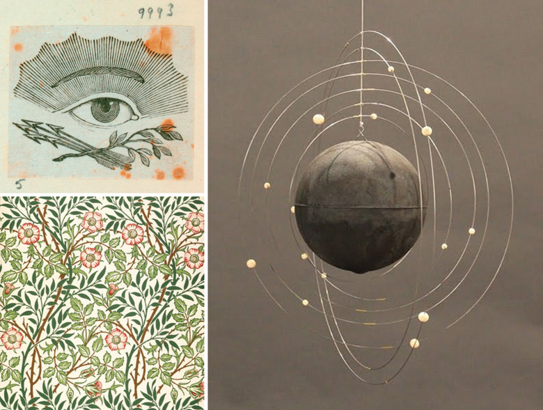
1. Volume 3, p.36 2. William Morris 3. Mobile (I found this via Pinterest with a link to Voila Gallery, sadly it looks like it's sold).
For those of you who have had a look at our new shop you might have noticed that we have a new logo also. We're planning on building a website in the next month or so, and wanted to really think about branding and how we wanted to portray ourselves in the design sense. While it is pretty weird looking back at past blog headers and business cards, I've never been unhappy with previous logos looks. At the same time they've often been a bit slapped together or made in isolation and we wanted to be a bit more thoughtful this time around. This is not to say that I won't still make and order totally new business cards on a whim, I am a slightly impulsive dreamer after all.
Neither Richard or I are trained in design (apart from a jaded year of art school each) but we both have a pretty strong sense of what we like and are self taught in Photoshop and Illustrator so we thought we'd give it a go at doing it ourselves. Plus we're pretty broke after our move, so.

We decided to both collect images that we like and threw them all together to see if we could find links between them. Colour, pattern, fonts (this is still a little up in the air), etc. Also, I tried really hard to not be a control freak about it all because of course Richard has a really great design sense and tempers my penchant for too much dusty pink and gold. I really loved the process of bringing all these varied ideas together, it took a bit for me to be confident about my choices though and led to long talks about why didn't we know that we could have studied art and taken on board what we liked while ignoring the annoying critical theory lecturer. Or, how great is the internet that we get to do this and build a business for ourselves without having to sit through the entire critical theory course!
Our idea was to design something that we could use and manipulate lots of different ways (to suit my indecisive nature), but would still be timeless. We wanted to be able to combine something that felt organic but still had clean lines. Evie was kind enough to act as a sounding board for us - we're pretty lucky to have such a creative group of friends (thanks again, internet!) and it reaffirmed how much I thrive on working with others. I'm really happy with the result and of course I've already tried playing around with it, using bits of it here and there, changing colours, mixing colours and adding backgrounds. I can't wait to work on the rest of our site now!

We've used it to make new packaging for our bookmarks, something we've been meaning to do for ages but never could never totally decide on how to do it. Or find the materials for that matter, it seems that New Zealand is a bit of a wasteland for packaging supplies. Bookmarks now come individually packaged in a cello sleeve with lovely textured card for the packaging. I love that the rays give a bit of a midcentury but a lot of witchy, third-eye type feel. Speaking of bookmarks, we're giving some away over on our Facebook page if you'd like to tell us your current or favourite summer/winter read!
 hello (at) blissinateacup (dot) com